Christmas Color Trends: 8 Vibrant Palettes to Inspire Joy
Christmas color trends bring a special kind of visual magic to the festive season, shaping the atmosphere of homes, storefronts, and public spaces. Each year introduces subtle shifts in palette preferences, influenced by lifestyle changes, interior design movements, and emotional connections to tradition. These evolving shades help set the tone for celebrations, guiding everything from tree decorations to table settings and lighting choices. Together, they reflect a balance of nostalgia and modern taste, creating spaces that feel warm, intentional, and memorable.
As celebrations become more personalized, color selection plays a central role in expressing mood and identity. Some people gravitate toward timeless combinations, while others embrace fresh interpretations that reflect contemporary living. Understanding how festive colors evolve allows decorators to strike a balance between tradition and originality without losing the essence of the season.
The Evolution of Festive Color Palettes

Holiday colors were once limited to a familiar range, but today’s festive design embraces flexibility and creativity. Earlier celebrations leaned heavily on symbolic hues tied to nature and tradition. Over time, social trends, design influences, and even sustainability awareness have reshaped how people approach holiday décor.
Modern palettes often blend classic shades with softer or unexpected tones. This shift reflects a desire for comfort and authenticity rather than excess. Instead of overwhelming spaces with intense colors, many decorators now aim for harmony and balance. Neutral foundations paired with carefully chosen accent shades create environments that feel inviting and thoughtful. Visit Christmas Aesthetic
Cultural influence also plays a role. Global design inspiration has introduced palettes that feel both festive and refined, borrowing ideas from Scandinavian minimalism, vintage European décor, and nature-inspired aesthetics. These influences encourage restraint while still allowing room for personality.
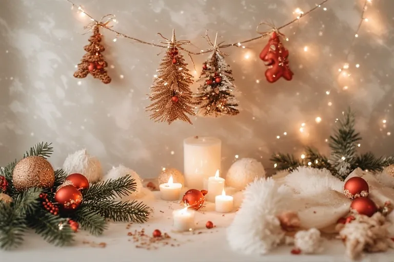
Traditional Colors with a Refined Touch

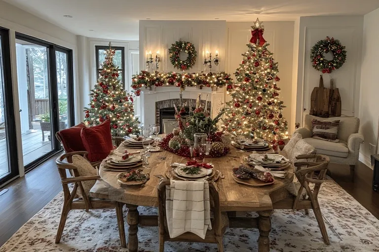
Classic festive colors remain popular, but their presentation has evolved. Red and green continue to symbolize celebration, warmth, and togetherness. However, they are often softened or styled differently than in the past.
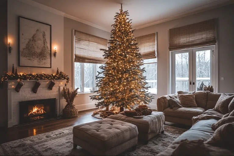
Deep reds paired with muted greens create a more elegant atmosphere than bright primary tones. Burgundy, cranberry, and forest green feel richer and more mature, especially when balanced with natural textures like wood, linen, or greenery. This approach keeps tradition alive while aligning with modern interior sensibilities.
Gold accents remain a favorite, but they are often used sparingly. Instead of dominating a space, metallic touches now appear in subtle details such as ribbon edges, ornament finishes, or candle holders. This restrained use enhances sophistication without overwhelming the décor.
Soft Neutrals and Earth-Inspired Shades
Neutral tones have gained significant attention in festive styling. Creams, warm whites, beige, and taupe create a calm foundation that allows decorative details to stand out naturally. These shades work particularly well in modern homes where simplicity and comfort are priorities.
Earth-inspired colors such as clay, sand, and stone add warmth while maintaining a grounded feel. When combined with greenery, pinecones, or dried florals, these hues create a serene seasonal atmosphere. This style appeals to those who prefer subtle elegance over bold contrast.
Neutral palettes also offer versatility. They transition seamlessly from early winter décor to full holiday styling, reducing the need for dramatic changes. This adaptability makes them a practical choice for long-lasting seasonal decoration.
Jewel Tones for Depth and Character
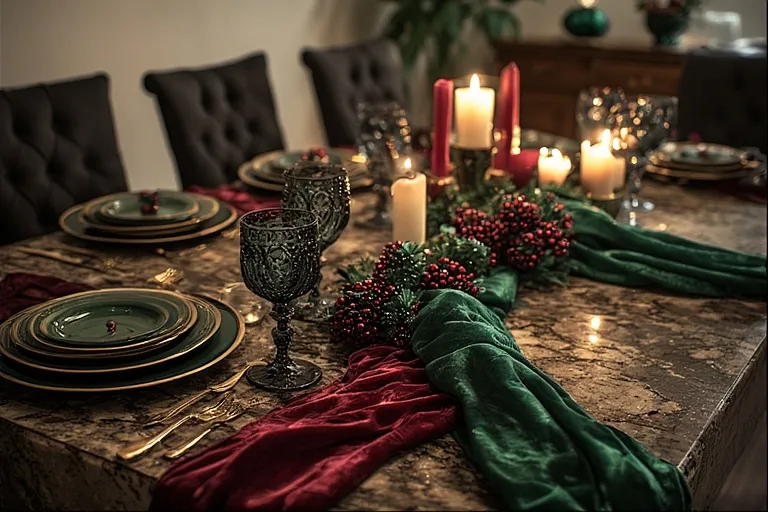
For those who enjoy richer visuals, jewel tones offer depth and drama without sacrificing refinement. Shades like emerald, sapphire, amethyst, and garnet bring a luxurious feel to festive spaces. These colors work particularly well in evening settings, where warm lighting enhances their intensity.
When used thoughtfully, jewel tones can elevate simple décor elements. A deep-colored ornament, velvet ribbon, or table runner can transform an otherwise neutral space into something striking. The key lies in balance—allowing one or two bold shades to shine rather than competing for attention.
This approach suits both traditional and contemporary homes. Jewel tones feel timeless yet adaptable, making them a strong choice for those who enjoy statement décor with lasting appeal.
Modern Pastels and Muted Accents
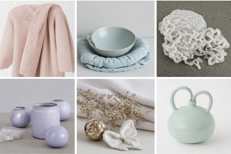
Pastel shades have quietly entered festive décor, offering a fresh alternative to stronger colors. Soft blush, dusty blue, muted lavender, and pale mint bring a gentle charm to seasonal settings. These tones feel especially inviting in smaller spaces, where bold colors might feel overwhelming.
Muted pastels pair well with metallic finishes and natural textures. Frosted ornaments, ceramic decorations, and soft fabrics enhance their understated beauty. This style creates a cozy, relaxed atmosphere that feels personal rather than performative.
Pastel-inspired décor often appeals to those seeking a lighter, more playful interpretation of the season. It reflects creativity and openness while maintaining a sense of warmth and celebration.
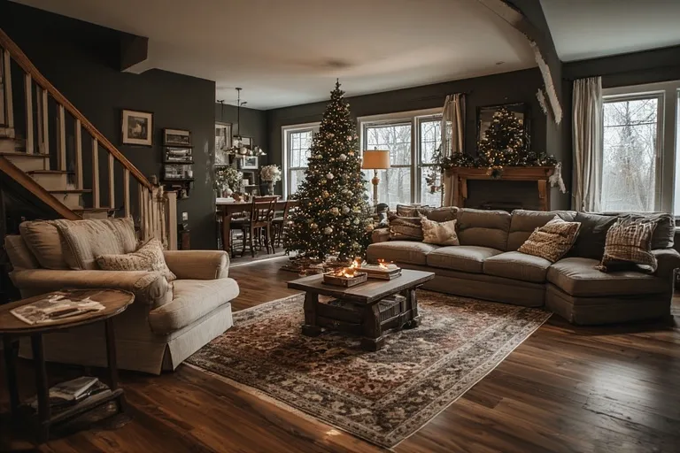
Christmas Color Trends in Modern Décor Styling
Today’s decorating choices reflect lifestyle shifts toward mindfulness and intentional design. Christmas color design now emphasize emotional comfort as much as visual appeal. People choose shades that resonate with their surroundings, personal preferences, and the way they want their spaces to feel during the holidays.
Minimalist homes often favor monochromatic or limited palettes, allowing textures and shapes to take center stage. Layering similar tones creates depth without visual clutter. In contrast, eclectic spaces may mix traditional and modern shades for a more expressive look.
Lighting plays an essential role in how colors are perceived. Warm lights enhance rich and neutral tones, while cooler lights highlight metallics and pastels. Thoughtful lighting choices ensure that colors appear cohesive and inviting throughout the day and evening.
Sustainable Color Choices and Natural Influences
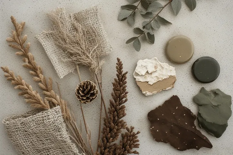
Sustainability has influenced festive décor in subtle but meaningful ways. Many people now prefer colors inspired by nature, reflecting a desire for simplicity and environmental awareness. Greens, browns, soft whites, and natural metallics echo outdoor landscapes and seasonal elements.
Reusing decorations year after year also encourages timeless color choices. Instead of following short-lived trends, decorators select palettes that remain relevant over time. This approach reduces waste while fostering a deeper emotional connection to seasonal traditions.
Natural materials such as wood, glass, fabric, and dried foliage complement these colors beautifully. The result is décor that feels authentic, comforting, and visually balanced.
Creating a Cohesive Color Story at Home
Successful festive styling relies on consistency rather than excess. Choosing a primary color palette and repeating it across different elements helps create harmony. Tree decorations, table settings, textiles, and wall accents should feel connected without appearing repetitive.
Accent colors add interest without overpowering the main palette. A single contrasting shade can draw attention to focal points like wreaths, centerpieces, or mantel displays. This intentional approach ensures that every element contributes to the overall atmosphere.
Personal touches complete the look. Handmade ornaments, heirloom pieces, or meaningful keepsakes add depth that no trend alone can provide. These details turn color choices into lasting memories.
Conclusion
Seasonal décor is more than visual decoration; it reflects emotion, tradition, and personal expression. Thoughtful use of color shapes how spaces feel during moments of celebration and togetherness. By understanding the influence of Christmas color trends, decorators can create environments that feel both festive and authentic. Whether leaning toward classic hues, soft neutrals, or modern accents, the right palette brings warmth and meaning to the season, leaving lasting impressions long after the holidays have passed.
What are the most popular Christmas colors this season?
Muted greens, warm neutrals, deep reds, soft blues, and brushed metallics are leading seasonal décor choices.
Are traditional Christmas colors still in style?
Yes, traditional colors remain popular but are now used in deeper, softer, and more refined shades.
How can I use trendy Christmas colors without overdecorating?
Focus on small accents like cushions, ribbons, table settings, or ornaments rather than full color saturation.
Do Christmas color trends work for modern homes?
Absolutely, current palettes are designed to complement minimalist, contemporary, and natural interiors.
Can Christmas décor colors be reused after the holidays?
Yes, many trending shades are neutral and timeless enough to blend into everyday home styling.
One Comment