Serene Color Palette Home: Inspire a Relaxing Vibe
A serene color palette home is all about creating an atmosphere of peace, balance, and understated beauty. In a world full of noise and chaos, our homes should serve as a retreat—a place that soothes our minds and refreshes our souls. The right color palette can completely transform your living environment, turning ordinary rooms into sanctuaries of calm. By understanding how colors affect our emotions and how to use them harmoniously, you can design a space that feels naturally comforting and effortlessly elegant.
Why Color Matters in Home Design
Color isn’t just about aesthetics—it’s emotional. The shades you choose have the power to influence your mood, energy levels, and even how spacious or cozy a room feels. Soft neutrals, muted pastels, and nature-inspired tones can make your home feel relaxing and grounded, while harsh contrasts or overly bright colors can overwhelm the senses.
Creating a serene home is about finding balance—using colors that complement each other, reflect natural light, and bring a feeling of quiet sophistication. The beauty of serene color schemes lies in their timeless appeal and the sense of comfort they bring to every corner. You have to look modern organic interiors
Characteristics of a Serene Color Palette
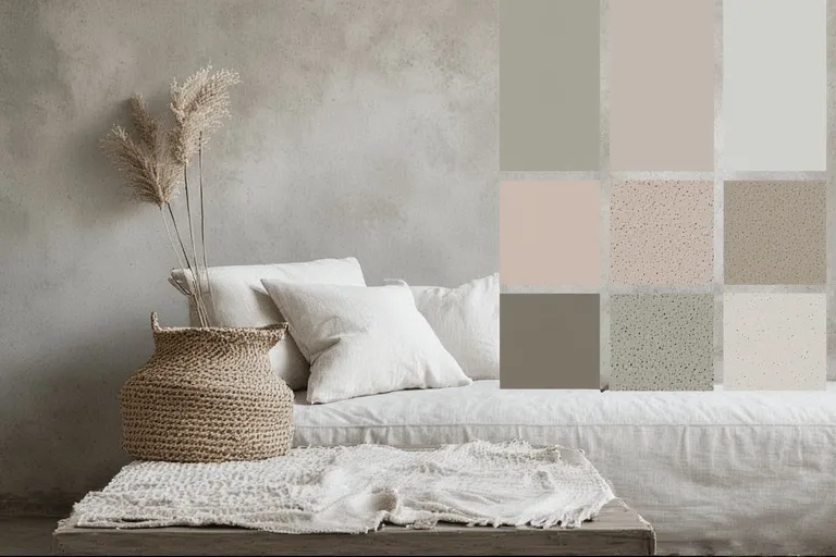
When curating a serene color palette, focus on harmony, simplicity, and subtlety. Here are the main characteristics that define a peaceful interior:
- Neutral foundation: Begin with whites, creams, or soft beiges as your base. These tones create a light, airy backdrop that works beautifully with almost any accent color.
- Muted hues: Opt for colors with low saturation, such as dusty blues, sage greens, blush pinks, or soft grays.
- Natural inspiration: Earth tones—like sand, stone, moss, and sky—evoke nature’s calm and keep the palette grounded.
- Consistency: Limit your color range to three or four key shades for a cohesive look.
- Soft contrasts: Avoid stark black-and-white combinations; instead, use gentle transitions between tones to create visual flow.
The Psychology Behind Serene Colors
Colors have psychological effects that influence our daily lives. Understanding them helps you choose shades that enhance well-being:
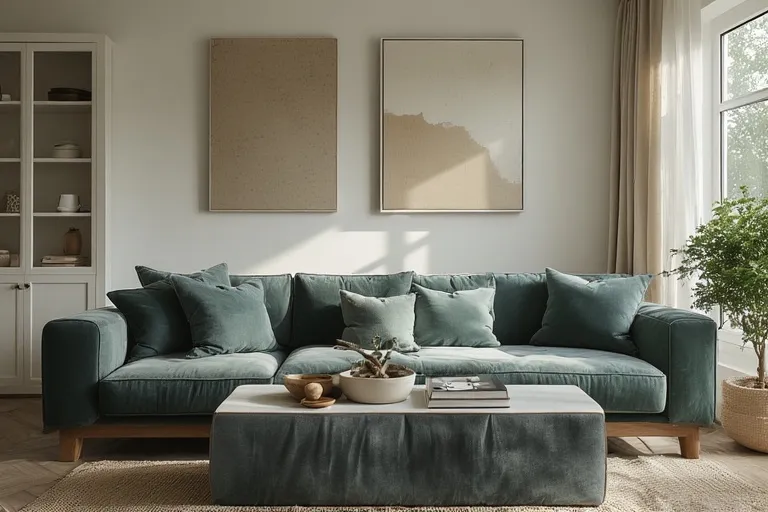
- Blue: Known for its calming and stabilizing qualities, blue lowers stress levels and promotes tranquility.
- Green: Symbolizes balance and renewal. It connects us to nature and fosters relaxation.
- Beige and Cream: Provide warmth and comfort without overpowering the senses.
- Gray: Represents neutrality and sophistication when used in soft, warm tones.
- White: Encourages clarity, openness, and a sense of spaciousness.
The key is moderation—too much of one shade can make a space feel flat, while balanced layering creates depth and serenity.
How to Create a Serene Color Palette Home
Designing a serene color palette home starts with thoughtful planning. It’s not just about choosing colors that look good together; it’s about how they make you feel. Here’s how to achieve that calming atmosphere step by step:
1. Start with Your Foundation Colors
Begin with your walls, floors, and larger furniture pieces. Stick to a base of whites, light grays, or warm neutrals. This creates a blank canvas that allows softer accent colors to shine.
2. Add Soft Accents
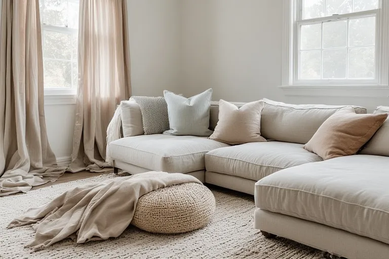
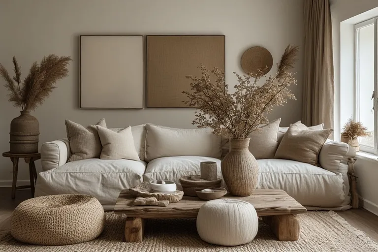
Layer in subtle hues through curtains, pillows, rugs, and throws. Blush pink, pale sage, soft taupe, or sky blue can add dimension without disrupting the calm aesthetic.
3. Bring Nature Indoors
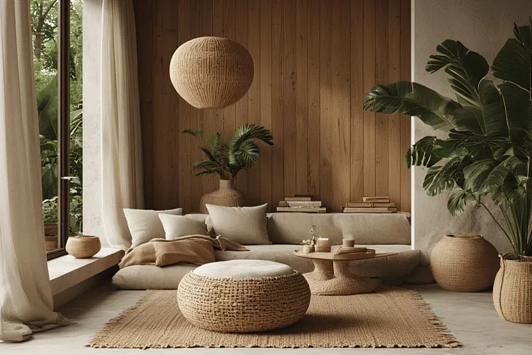
Natural textures—like wood, linen, rattan, and stone—enhance the sense of serenity. Green plants not only purify the air but also introduce life and color in a gentle way.
4. Balance Light and Shadow
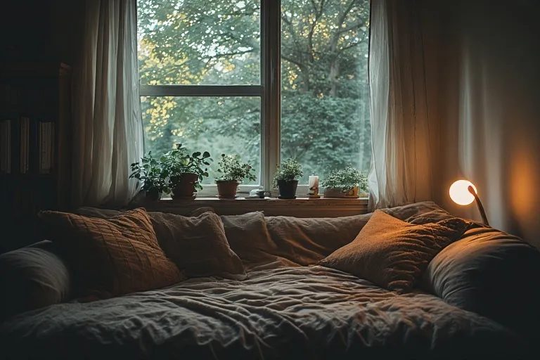
Lighting plays a major role in how colors appear. Use warm-toned lighting to maintain a cozy atmosphere, and make the most of natural light during the day.
5. Keep It Minimal
A serene home thrives on simplicity. Avoid clutter and let your color palette shine through clean lines, open spaces, and well-chosen decor pieces.
Room-by-Room Ideas for a Serene Home
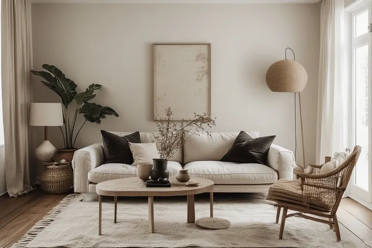
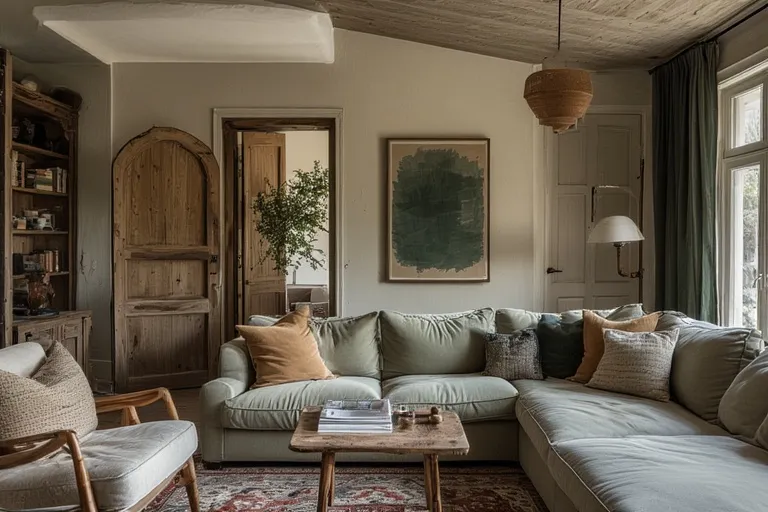
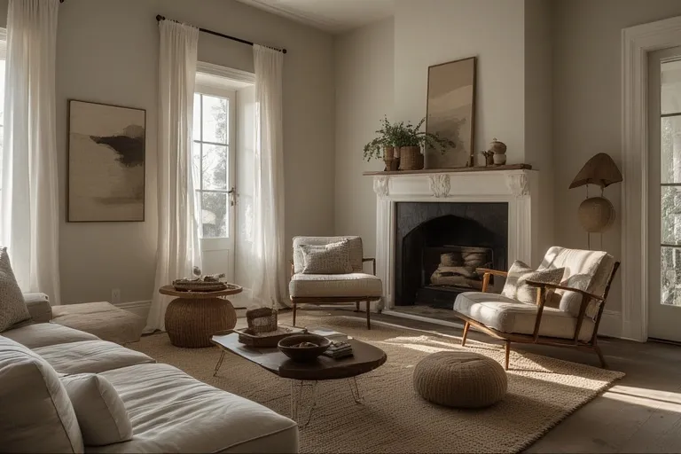
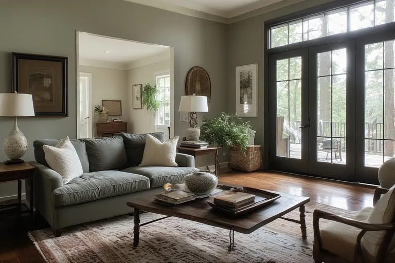
Living Room
Choose a base of cream or soft gray walls. Add a beige linen sofa, textured throw blankets, and pastel-toned cushions. A light wood coffee table and sheer white curtains can complete the look.
Bedroom
Opt for calming blues or muted greens. Soft bedding, minimal artwork, and dimmable lighting will turn your bedroom into a true sanctuary for rest.
Kitchen
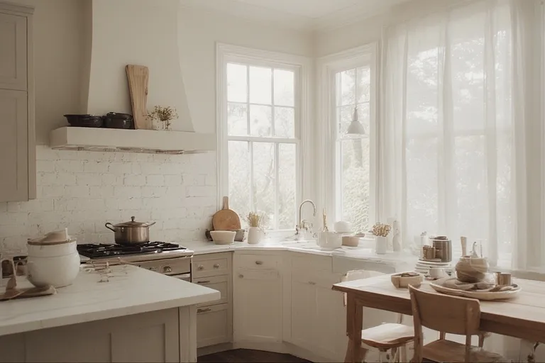
White or off-white cabinets paired with light wooden shelves create a refreshing atmosphere. Introduce warmth with ceramic dishes or subtle terracotta accents.
Bathroom
Use pale stone tiles, white towels, and a few green plants. The goal is to create a spa-like experience that feels both clean and calming.
Home Office
Soft gray walls with natural wood furniture can help you stay focused without feeling overwhelmed. Add muted green or blue decor to promote concentration and peace.
Tips for Maintaining a Serene Look
- Avoid clutter – visual noise can disrupt the calm ambiance.
- Choose quality over quantity – fewer, well-chosen decor items make a stronger impact.
- Incorporate texture – combine materials like cotton, jute, and wool for warmth and depth.
- Use art wisely – select minimalist or nature-inspired artwork that blends with your palette.
- Refresh regularly – occasionally rotate accessories or add fresh flowers to keep the atmosphere lively.
The Role of Lighting in Serene Interiors
Even the most beautiful color palette can fall flat without proper lighting. Natural light enhances soft tones, while warm LED bulbs maintain a cozy vibe after sunset. Avoid harsh white lights—they can make a serene palette feel cold or sterile. Instead, layer your lighting:
- Ambient light for general illumination
- Task light for reading or cooking
- Accent light for highlighting artwork or architectural details
This layered approach keeps your home inviting and balanced at any time of day.
Texture and Material Pairing
A serene color palette becomes more engaging with texture variation. Pair smooth surfaces with tactile materials like wool throws, linen cushions, or jute rugs. Matte finishes generally look more soothing than glossy ones. By combining natural textures and soft colors, your home gains a sense of organic warmth and understated luxury.
Common Mistakes to Avoid
- Overusing white: Too much white can feel sterile instead of peaceful. Balance it with soft beige or gray undertones.
- Ignoring undertones: Some “neutral” shades have warm or cool undertones that may clash—always test samples before painting.
- Mixing too many colors: Stick to a cohesive palette of 3–5 shades to avoid visual clutter.
- Neglecting lighting: Poor lighting can change how your chosen colors appear throughout the day.
Conclusion
Serene color palette home design is more than a trend—it’s a lifestyle choice that celebrates calm, harmony, and natural beauty. By choosing gentle colors, layering soft textures, and keeping your space free from clutter, you create a haven that reflects peace and balance. Whether you live in a small apartment or a spacious house, a serene palette transforms your environment into a soothing retreat—one that nurtures both your mind and spirit every single day.
Q1. What is a serene color palette home?
A serene color palette home uses soft, calming hues to create a peaceful and harmonious living space.
Q2. Which colors make a home feel serene?
Neutral shades like beige, white, soft gray, and pastel blues or greens bring serenity.
Q3. Why choose a serene color palette for interiors?
It promotes relaxation, reduces stress, and enhances visual comfort.
Q4. Can bold colors fit into a serene color palette home?
Yes, when used as subtle accents or highlights to maintain balance.
Q5. How can lighting enhance a serene color palette?
Natural and soft lighting emphasize the calm tones, making the space feel warm and tranquil.
One Comment